8 Steps to Maximizing Facebook Timeline for Business and Brand Pages
If you’re a small business owner, you may have logged into Facebook today to see this friendly little message:

I’m guessing many of you did by the number of frantic emails and phone calls I received. No, it’s not a cruel Leap Day joke. This is happening.
I knew the change was coming, but I didn’t know all of the details. I also didn’t know that, unlike personal pages, the time to convert would be so short. So, after much exploring and tweeting and shouting something that rhymes with “Mother Zucker-berg,” I have accepted the change and am ready to capitalize on it.
Here are 8 things you should know about the new layout:
1.) Review old posts
If there is only one thing you do from this list, make sure it’s this one. With the current/soon-to-be old layout people had to scroll forever to get to really old posts. Now that one post from the grumpy customer no one could please is as easy to find as the one posted yesterday. Review your page and if you find negative posts you have taken care of or posts that are out-of-date you can delete or hide them. We advise clients not to delete negative comments. It’s an opportunity to show your consumers that you care and will take care of issues quickly. However, many of these issues are resolved offline so that not-so-nice post should be hidden away.
2.) No more fan-gated landing pages
This one in particular had me ready to flip a table a la Teresa Giudice. Now you can decide if people coming to your page will land on your wall or a tab. And if you have a fan-gated tab, you can show people who have not yet liked your page something different than the people who have. It was a fantastic marketing tool and greatly increased like conversions. Soon Timeline will be the default view for all users. Dislike.
3.) Large cover photo at top
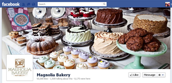
Part of this is great, especially if you have beautiful images that help sell your product or brand. If you don’t, get a designer or invest in some stock photography. This is the first thing people will now see when they come to your page.
The new dimensions are 851×315 pixels. Keep that in mind when choosing your image.
But, Facebook’s new rules dictate that you cannot have the following on your image:
— Price or purchase information, such as “40% off” or “Download it at our website”.
— Contact information, such as web address, email, mailing address or other information intended for your Page’s About section.
— References to user interface elements, such as Like or Share, or any other Facebook site features.
— Calls to action, such as “Get it now” or “Tell your friends”.
Now I’m irritated and craving cupcakes.
4.) New profile picture shape and about section

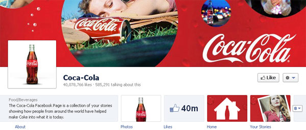
This is pretty straight forward. The new profile picture is a box, 180×180 pixels. Here early-adapter Coca-Cola has an old-school bottle of soda with strategically placed bubbles in the cover image. There is a lot of room for creativity here. Mashable has a round up of funny Timeline covers to inspire you.
There are also more characters allowed in the About section so make sure you update your description.
When we checked, Pepsi wasn’t on the bandwagon yet. Maybe they’re more Google+ people.
5.) Highlight apps at the top of page

Good-bye tabs, hello app boxes. You can now choose up to 12 apps to features on your page, with the first four displayed under your cover image. The photos box is always the first by default.
I actually like this feature (gasp, did I just say that?) because this is the perfect spot to highlight your best content. I often received fan feedback from client pages saying they had a hard time finding certain tabs because they didn’t know where to look. Now you have a nice image right up top to grab fan attention immediately.
6.) Pin, edit, hide posts
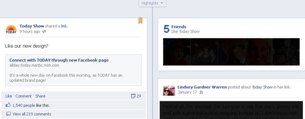
It’s no surprise that the Today Show’s Facebook page was perfectly put together today since the new Facebook Timeline was announced there this morning. Facebook now allows you to pin one post to the top of your page for up to seven days. It’s a perfect spot for a video or timely announcement. Take advantage of it. You can choose the post by clicking on the pencil in the upper right corner of the post. You can also edit your posts through that menu.
You can also see my friends who like the Today Show are shown at the top of the timeline. Another new feature is that any of my posts, or posts from my friends, about this page will also show up. Here I actually shared a CNN article that mentioned the Today Show, but it knew to list it. A little spooky. The good news is only my friends will see this post on this brand’s page. But brand admins should keep an eye on this feature for negative comments and feedback.
7.) Milestones and Highlighted posts
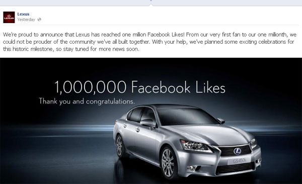
When we do branding projects for companies, there is always a section where we ask employees to describe their company as a real person. That’s how you need to treat Timeline. Milestones are major events in your company’s life. When were you born? Did you launch a new website? Release a new product? That’s a milestone. If you can, add these events before you switch over.
Another way to draw attention to posts, past and present, is to highlight them (see above). Highlighted posts are the full width of the page and are perfect for important images. You do this by clicking the star in the top right of the post. Dimensions are 843×403 pixels.
8.) Admin interface and direct message
Finally! The one big upgrade that admins have been asking for has been granted. Fans can now direct message pages. Pages cannot reach out to fans first, but they can respond. If you run a contest, the winner can now message you their details privately. I’m sure this will also be an avenue for complaints, but better through a message than on your page.
The admin interface is also very different. If you’re an admin of multiple pages you may really like the changes. This is something you just need to explore yourself.
Summary
This is where I tell you about how wonderful Timeline will be for engagement, product display, and so on. It’s all probably true. But initially it’s going to take a lot of work. Take your time over the next month and get everything in place. And since Timeline is the only Facebook you’re going to get, love the one you’re with.
— Review your timeline, hide/delete unwanted posts
— Choose a powerful, eye-pleasing cover image (851×315 pixels) and profile picture (180×180 pixels)
— Write a succinct but informative description
— Feature your best apps first
— Pick the one post that will best achieve your current goals and “pin” it
— Think of your company as a real person and create milestones
— Highlight your best posts and achievements (843×403 pixels)
2 Comments
Molly · March 1, 2012 at 10:58 am
Very helpful, Lindsey!
Libby Fischer Hellmann · March 1, 2012 at 11:12 am
You’re always one or two or eight steps ahead of everyone else… Thanks!
Comments are closed.